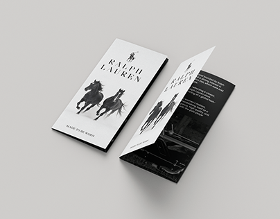
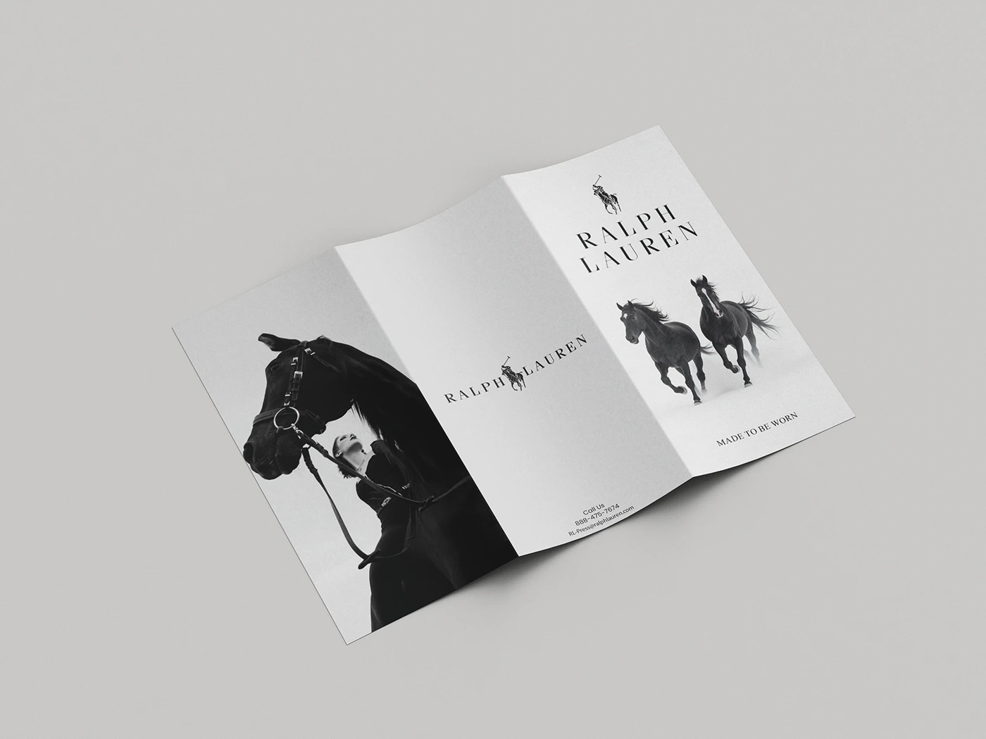
A premium tri-fold brochure designed for a luxury fashion brand — combining editorial monochrome photography, refined typography, and an elegant layout to create a print piece that speaks to the brand's identity and craftsmanship.
The client is a luxury fashion brand with a strong visual identity built around equestrian heritage, monochrome editorial photography, and understated elegance. As the brand expanded into physical retail and event spaces, they needed a premium print brochure that could carry their identity off the screen — something tangible, refined, and worthy of their audience.
Off-the-shelf print templates and generic design work weren't an option for a brand at this level. The brochure had to feel like an extension of the brand itself — not a marketing leaflet. Every fold, every typographic choice, and every image placement had to reflect the same premium standard their customers expect from the products themselves.
No existing print collateral to support retail, events, and press activity
Brand identity needed to translate from digital into a physical, tactile format
Generic or templated brochure designs would undermine the brand's luxury positioning
High-quality editorial photography needed to be laid out to maximum visual impact
Final artwork needed to be print-ready to exacting production standards
Our Approach
The Solution
Smartal Solutions designed a bespoke tri-fold brochure that puts the brand's visual world front and centre. We worked from the brand's existing identity — its equestrian imagery, serif typography, and monochrome palette — and structured the three-panel layout to unfold as an editorial experience rather than a conventional leaflet. The cover commands attention. The interior rewards it.
The layout uses the full bleed of each panel deliberately — hero photography on the outer panels, structured brand messaging and contact details on the inner spreads, all balanced with generous white space and precise typographic hierarchy. The result is a piece that feels considered, confident, and entirely on-brand. Final artwork was prepared to full print-ready specification including bleed, crop marks, and CMYK colour profiles.
Custom tri-fold brochure layout designed from scratch — no templates
Editorial image placement across all panels using brand's monochrome photography
Typographic hierarchy set in brand-aligned serif and sans-serif pairings
Full bleed cover design with brand logo, hero image, and tagline
Inner spread layout balancing photography, brand messaging, and contact information
Print-ready final files — bleed, crop marks, CMYK, high resolution PDF export
Outcomes
The Result
Custom
Bespoke Design
Print
Ready Artwork
Luxury
Brand Standard
The client received a finished tri-fold brochure that functions as a true brand asset — something that can sit on a retail counter, be handed to press, or accompany a product purchase without looking out of place. The design earned immediate approval from the client team with no revision rounds, a reflection of how closely the visual direction aligned with the brand's identity from the outset.
Print-ready files were delivered to full production specification, ready to send directly to any commercial printer. The brochure is now in active use across the brand's retail and event presence.