GRID X, a newly launched creative digital studio, needed a visual identity that could stand toe-to-toe with established agencies while signaling their fresh, boundary-pushing approach. Their temporary wordmark lacked personality and failed to communicate the studio's core philosophy: structured creativity.
In a saturated market of creative studios, they needed a mark that was instantly memorable, scalable across digital and physical applications, and versatile enough to evolve with their growing service offerings — from branding to motion design to immersive web experiences.
No existing logo or visual identity system
Needed to compete with established creative agencies
Mark had to work across digital, print, and motion contexts
Required a color palette that felt modern yet timeless
Logo needed to convey both structure and creative freedom
Our Approach
The Solution
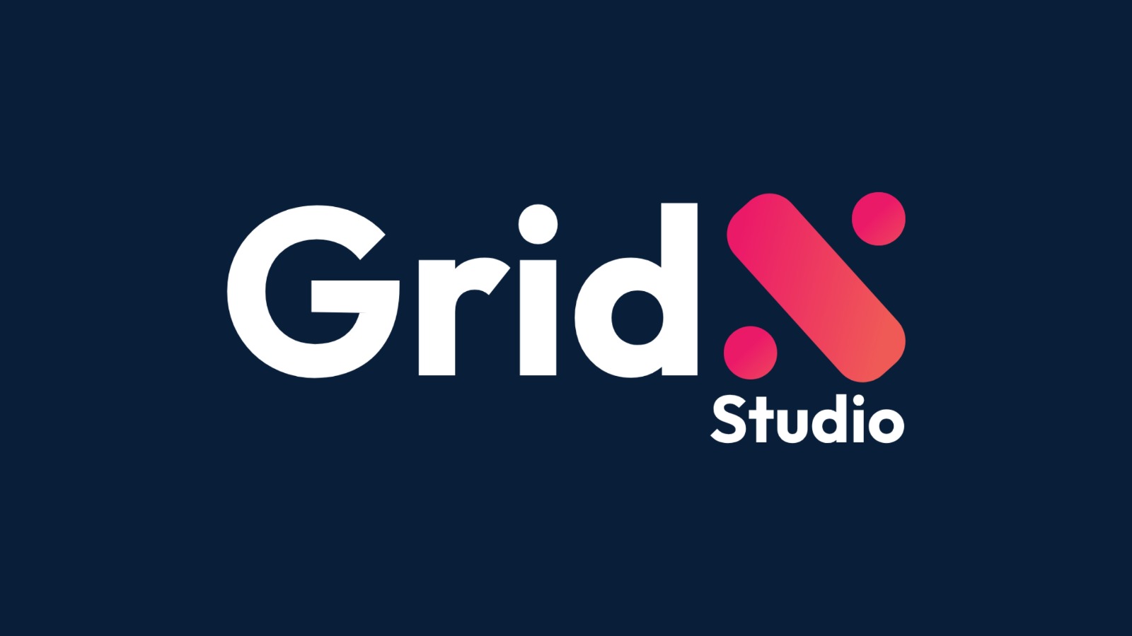
We explored the intersection of grid systems and organic expression — the foundation of great design. The final mark combines a bold, geometric wordmark with a dynamic "X" symbol built from rounded capsules and dots, suggesting pixels, connection points, and creative sparks all at once.
The color system pairs deep navy authority with vibrant magenta-pink energy — a combination that feels both premium and playful. The logo was designed to perform flawlessly at favicon size, on studio signage, and in animated motion graphics, with every curve and proportion mathematically considered.
Custom geometric wordmark with distinctive "X" symbol
Dual-color system: primary (white on navy) and accent (pink gradient)
Scalable vector construction for all sizes and formats
Social media profile and cover asset templates
Animated logo variant for video and motion graphics
Brand guidelines with color codes, spacing, and usage rules
Outcomes
The Result
100%
Client Approval
2x
Social Growth
Zero
Revisions Needed
The GRID X identity was approved on first presentation — the client immediately connected with the balance of structure and playfulness. The logo has become the studio's signature across their portfolio site, social channels, and client presentations.
Within weeks of launch, the studio reported increased inbound inquiries and stronger recognition at industry events. The flexible color system allows them to adapt the mark for different campaign moods while maintaining brand consistency.