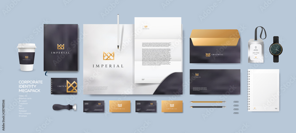
A complete corporate identity system for a financial services firm — from logo concept to full stationery suite, delivering trust, professionalism, and market distinction.
A growing financial services firm approached Smartal Solutions with an outdated visual identity that failed to communicate trust, stability, and modern professionalism. Their existing logo was pixelated, inconsistent across platforms, and lacked the premium feel expected in the finance sector.
Without a cohesive brand system, they were losing credibility with high-net-worth clients and struggling to differentiate themselves in a crowded market of established competitors. Every touchpoint — from business cards to digital presentations — told a different visual story.
Outdated logo with poor scalability across print and digital
No brand guidelines or color consistency
Weak visual differentiation from competitors
Lack of trust signals in client-facing materials
Inconsistent typography and spacing across all assets
Our Approach
The Solution
We began with a deep competitive audit of the financial services landscape, analyzing color psychology, typography trends, and trust-building visual cues. Our strategy centered on creating a mark that balances authority with approachability — using a bold checkmark symbol to represent security and approval, paired with strong, stable typography.
The final identity system includes a primary logo mark, a dark-background variant for premium applications, a full color palette anchored in deep navy and vibrant green, and a complete stationery suite. Every element was designed to scale flawlessly from a favicon to a billboard.
Custom logo design with symbolic checkmark and human figure
Dual-color system: primary (green on light) and inverse (white on dark)
Corporate typography pairing for headlines and body text
The new identity was approved on the first presentation — a testament to the strategic alignment between our design direction and the client's vision. The brand now projects authority and trust across every touchpoint, from investor presentations to social media.
The client reported increased confidence in client meetings and a measurable uptick in inbound inquiries attributed to the refreshed, professional appearance. The full brand guidelines ensure their internal team maintains consistency as they scale.